


 Click a thumbnail to change media.
Finalist
Package Design
Foods Entrant: Havas City, Paris Monoprix
Foods Entrant: Havas City, Paris Monoprix
Credits
Corporate Name of Client: Monoprix
Agency Account Directors: Charlotte David/Julie Bresson/
Timandra Breot
Agency: Havas City, Paris/BETC Euro RSCG, Paris
Creative Director: Florence Bellisson
Copywriters: Dominique Marchand/Valentine Gilbert/
Lucie Pardo
Design Conception: Cleo Charuet
Designer: Arnaud Deroudilhe
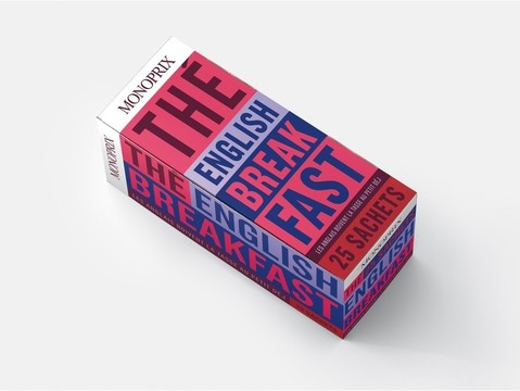
Translation: Tomates Entières (Peeled Tomatoes) Lait Demi-Écrémé (Half-Fat Milk) Thé English Breakfast (English Breakfast Tea) Haricots Verts Fins (Skinny Green Beans) Chips Ondulées (Potato Chips) HUILE D'OLIVE (OLIVE OIL)
Basic description of the project:
Paying tribute to Pop Art and readopting the bayadere style of the brand's communication, we chose a colorful and militant look, both straight and cheerful. The products are not shown, but exclusively named on their packaging, in big capital letters creating a clear and graphic design. Each of them has a unique, amusing phrase or witty word play. Every product is an ambassador of the brand's message: daily life should never be routine, but beautiful and fun.
Corporate Name of Client: Monoprix
Agency Account Directors: Charlotte David/Julie Bresson/
Timandra Breot
Agency: Havas City, Paris/BETC Euro RSCG, Paris
Creative Director: Florence Bellisson
Copywriters: Dominique Marchand/Valentine Gilbert/
Lucie Pardo
Design Conception: Cleo Charuet
Designer: Arnaud Deroudilhe
Translation: Tomates Entières (Peeled Tomatoes) Lait Demi-Écrémé (Half-Fat Milk) Thé English Breakfast (English Breakfast Tea) Haricots Verts Fins (Skinny Green Beans) Chips Ondulées (Potato Chips) HUILE D'OLIVE (OLIVE OIL)
Basic description of the project:
Paying tribute to Pop Art and readopting the bayadere style of the brand's communication, we chose a colorful and militant look, both straight and cheerful. The products are not shown, but exclusively named on their packaging, in big capital letters creating a clear and graphic design. Each of them has a unique, amusing phrase or witty word play. Every product is an ambassador of the brand's message: daily life should never be routine, but beautiful and fun.
LIA 2011©